Python Code
Reproducible code for figures in Understanding Data
Each entry below links to a Jupyter notebook that produces the corresponding figure from the book. Click Run interactively in browser to open an interactive session — no installation required. The notebook runs entirely in your browser via JupyterLite. If it's slow to load, click View code to browse the static Python code and figures instantly.
Every notebook here is yours to modify — swap in your own colors, styling, and data, and use it as a starting point for your own publication-quality graphics.
KDE Illustration
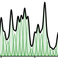
Kernel density estimates for a 100-point SBP dataset using four different kernel widths (σ = 0.4, 1, 2, 3), showing how bandwidth affects smoothness.
Three-Cluster Scatter Plot
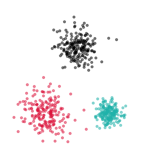
An artificial (X, Y) data set with three clusters generated via Gaussian blobs, illustrating how scatter plots reveal grouping structure.
Iris Dataset 2D KDE
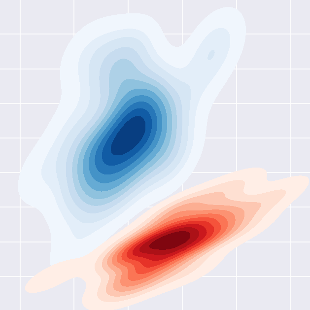
2D kernel density estimate of sepal width vs sepal length for two Iris species, using color instead of height to show density.
Simulating Probabilities: How many girls?
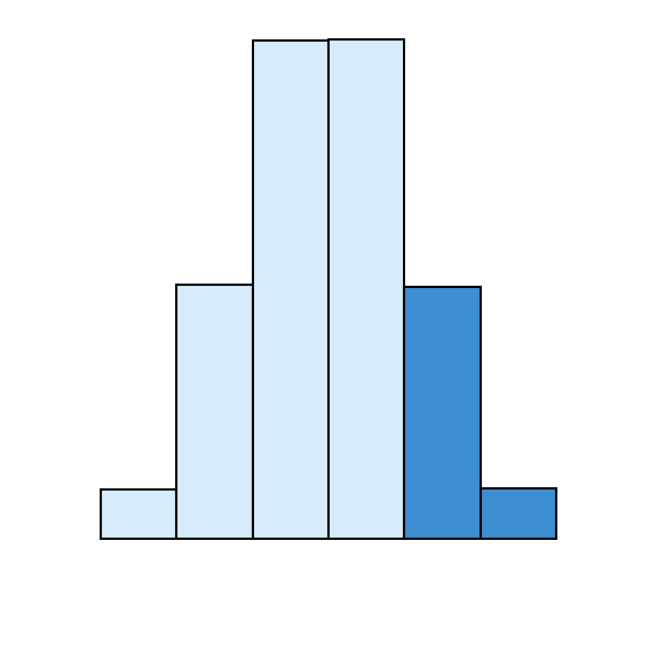
Null distribution for the number of girls in a family of 5 children, from 100,000 simulated families with equal probabilities of boys and girls.
Girl Birth Rate: Two-Sided NHST
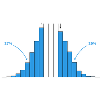
Null-hypothesis simulation for a 52/48 girl/boy birth split, shading both tails of the null distribution to compute a two-sided surprise value.
Sex Ratio Near Power Plants: Confidence Interval
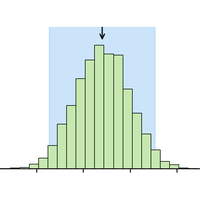
Resampling-based confidence interval for a study observing 52% girl births in 300 births near power plants.
T-Cell Count: Two-Group Comparison
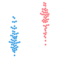
Beeswarm, histogram, KDE, summary statistics, and big-box NHST resampling for Control vs Treatment groups.
Survival Data: Two-Group Comparison
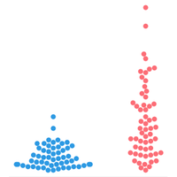
Beeswarm, histogram, summary statistics with boxplot, and big-box NHST resampling for Control vs Treatment cancer survival data.
Swimsuit vs Wetsuit Swimming Speed
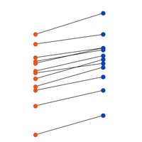
Dot plots, paired-differences plot, and independent vs paired null distributions for paired swim speed data.
T-Cell Count: Three-Group Comparison
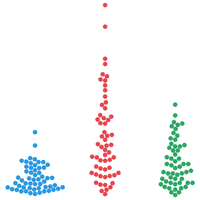
Omnibus resampling test and pairwise post-hoc comparisons — choosing big-box vs two-box by variance ratio — with p-values and 99% confidence intervals, for T-cell counts across a control and two drug groups.
Titanic Survival by Class
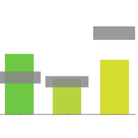
Observed and expected contingency tables, NHST null distribution, and Mt. Fuji insignificance-band plot for survival by passenger class.
Wildfire Regression & Resampling-based CI
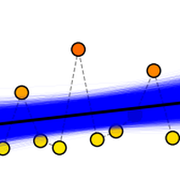
OLS regression of wildfire area over time, null-hypothesis shuffle test, and resampling-based confidence interval for the slope.
Power of a Study
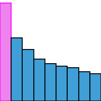
Bootstrap NHST power simulation comparing sample sizes of n = 10 and n = 25, showing how power increases with a bigger study.
Bayesian Clinical Trial
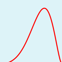
Bayesian updating of a drug's cure rate as 10 patients come in one at a time, plus the null-hypothesis distribution and p-value for the same data.
We follow the excellent exposition of Donald Berry's Bayesian clinical trials (Berry, 2006).