Three-Cluster Scatter Plot
Figure 2.22 An artificial (X, Y) data set with three clusters generated via Gaussian blobs, illustrating how scatter plots reveal grouping structure in data.
Every notebook here is yours to modify — swap in your own colors, styling, and data, and use it as a starting point for your own publication-quality graphics.
▶ Run interactively in browser ↗
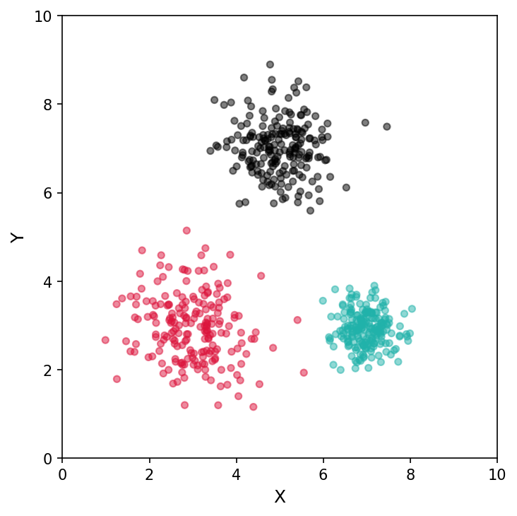
Figure 2.22 An artificial example of an (X, Y) data set that has three clusters.
Figure 2.22 — Three-cluster scatter plot
%matplotlib inline
import numpy as np
import matplotlib.pyplot as plt
from sklearn.datasets import make_blobs

X, truth = make_blobs(n_samples=600, centers=[[5, 7], [7, 3], [3, 3]], cluster_std=[0.6, 0.4, 0.8], random_state=2 )

# Colors: charcoal (top), teal (bottom-right), pink (bottom-left)
palette = ['dimgray', 'lightseagreen', 'palevioletred']
colors  = [palette[t] for t in truth]

fig, ax = plt.subplots(figsize=(5, 5))
ax.scatter(X[:, 0], X[:, 1], s=50, c=colors, alpha=0.85)

ax.set_xlim(0, 10)
ax.set_ylim(0, 10)
ax.set_xlabel('X', fontsize=12)
ax.set_ylabel('Y', fontsize=12)
ax.set_xticks(range(0, 11, 2))
ax.set_yticks(range(0, 11, 2))

plt.tight_layout()
plt.savefig('three_clusters.png', dpi=150, bbox_inches='tight')
plt.show()