Bayesian Clinical Trial
Figures 12.25–12.26
Every notebook here is yours to modify — swap in your own colors, styling, and data, and use it as a starting point for your own publication-quality graphics.
Bayesian updating of the belief about a drug's cure rate θ as 10 patients come in one at a time, starting from a flat prior, plus how the posterior would morph depending on the 11th patient's outcome. Then, the frequentist counterpart: the null-hypothesis distribution of the cure rate under a 35% background rate, used to compute a p-value for the same 10 patients. This is the static view of the notebook — click below to run it live in your browser.
▶ Run interactively in browser ↗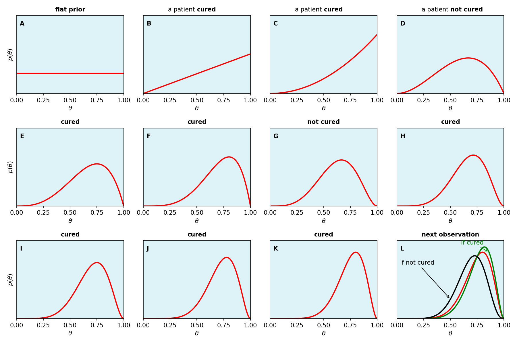
Figure 12.25 Panels A–K: successive updates of the probability distribution over θ as 10 patients come in the door. Panel L: how the result of the 11th patient would morph the distribution, cured (green) or not cured (black), overlaying the prior from panel K (red).
Setup — discrete grid over θ
%matplotlib inline
import numpy as np
import matplotlib.pyplot as plt
# Discrete-grid Bayesian updating: theta is a 100-point grid, the prior is
# flat, and each patient's outcome multiplies the running posterior by
# theta (cured) or 1 - theta (not cured), then renormalizes so the grid
# sums to 1.
d = 0.01
theta = np.arange(0, 1, d) + d
prior = np.array([1 / len(theta)] * len(theta))
data = [1, 1, 0, 1, 1, 0, 1, 1, 1, 1] # 1 = cured, 0 = not cured
p_lst = [prior]
cur = prior
for dpt in data:
p_theta = theta if dpt == 1 else 1 - theta
posterior = p_theta * cur / np.sum(p_theta * cur)
cur = posterior
p_lst.append(cur)
# Panel L: the two ways the 11th patient's result would morph the posterior
# from panel K, computed the same way from p_lst[-1].
last = p_lst[-1]
if_cured = theta * last / np.sum(theta * last)
if_not_cured = (1 - theta) * last / np.sum((1 - theta) * last)Figure 12.25 — the 3×4 panel grid
titles = [
    ("", "flat prior"),
    ("a patient", "cured"), ("a patient", "cured"), ("a patient", "not cured"),
    ("", "cured"), ("", "cured"), ("", "not cured"),
    ("", "cured"), ("", "cured"), ("", "cured"), ("", "cured"),
]
labels = list("ABCDEFGHIJK")

bg_color = "#ddf3f8"
ymax = 0.039


def styled_title(ax, prefix, word):
    y = 1.04
    if prefix:
        ax.text(0.5, y, prefix + " ", transform=ax.transAxes, ha="right", va="bottom")
        ax.text(0.5, y, word, transform=ax.transAxes, ha="left", va="bottom", fontweight="bold")
    else:
        ax.text(0.5, y, word, transform=ax.transAxes, ha="center", va="bottom", fontweight="bold")

fig, axes = plt.subplots(3, 4, figsize=(12, 8))

for i, (p_theta, (prefix, word), letter) in enumerate(zip(p_lst, titles, labels)):
    ax = axes[i // 4, i % 4]
    ax.set_facecolor(bg_color)
    ax.plot(theta, p_theta, color="red", lw=2)
    ax.text(0.03, 0.93, letter, transform=ax.transAxes, fontweight="bold", va="top")
    styled_title(ax, prefix, word)
    ax.set_xlim(0, 1)
    ax.set_xticks([0, 0.25, 0.5, 0.75, 1])
    ax.set_ylim(0, ymax)
    ax.set_yticks([])
    ax.set_xlabel(r"$\theta$")
    if i % 4 == 0:
        ax.set_ylabel(r"$p(\theta)$")

# Panel L: how the result of the 11th patient (next observation) would morph
# the posterior from panel K, depending on whether they are cured or not.
ax = axes[2, 3]
ax.set_facecolor(bg_color)
ax.plot(theta, last, color="red", lw=2)
ax.plot(theta, if_cured, color="green", lw=2)
ax.plot(theta, if_not_cured, color="black", lw=2)

ax.annotate(
    "if cured", color="green",
    xy=(0.86, if_cured[int(0.86 / d) - 1]), xytext=(0.6, 0.037),
    arrowprops=dict(arrowstyle="->", color="green"),
)
ax.annotate(
    "if not cured", color="black",
    xy=(0.5, if_not_cured[int(0.5 / d) - 1]), xytext=(0.03, 0.027),
    arrowprops=dict(arrowstyle="->", color="black"),
)

ax.text(0.03, 0.93, "L", transform=ax.transAxes, fontweight="bold", va="top")
styled_title(ax, "", "next observation")
ax.set_xlim(0, 1)
ax.set_xticks([0, 0.25, 0.5, 0.75, 1])
ax.set_ylim(0, ymax)
ax.set_yticks([])
ax.set_xlabel(r"$\theta$")

fig.tight_layout()
fig.savefig("figures/bayes_clinical_trial.png", dpi=150)
Figure 12.26 — null distribution & p-value
from collections import Counter

# Simulate 10,000 trials of 10 patients each with a background (null) cure
# rate of 35%, and tabulate the resulting cure rate for each trial.
np.random.seed(0)
l = 10
null_cure_rate = 0.35
cure_rate_lst = []
for i in np.arange(10000):
    s = np.random.choice([0, 1], l, replace=True, p=[1 - null_cure_rate, null_cure_rate])
    cure_rate = np.sum(s) / l
    cure_rate_lst.append(cure_rate)

x = np.round(np.arange(0, 1.01, 0.1), 1)
cnt = Counter(cure_rate_lst)
counts = [cnt[v] for v in x]
probs = [c / 10000 for c in counts]

# theta_obs is the cure rate actually observed in the 10 real patients
# (the same `data` used to build Figure 12.25).
theta_obs = sum(data) / len(data)
n_ge = sum(c for xi, c in zip(x, counts) if xi >= theta_obs - 1e-9)
pos = np.arange(len(x))
fig, ax = plt.subplots(figsize=(7.5, 4))
bar_color = "#3f7fd6"
ax.bar(pos, counts, width=0.55, color=bar_color, align="center")
y_chart_max = 2700
ax.set_yticks([0, 500, 1000, 1500, 2000, 2500])
ax.set_xticks(pos)
ax.set_xticklabels([f"{v:g}" for v in x])
ax.set_xlabel(r"cure rate $\theta$")
ax.set_ylabel("count")
for spine in ["top", "right"]:
ax.spines[spine].set_visible(False)
col_edges = [-0.5 + i for i in range(len(x) + 1)]
# --- table above the chart: "count" and "probability" rows ---
row_h = y_chart_max * 0.14
y_bottom = y_chart_max
y_mid = y_bottom + row_h
y_top = y_mid + row_h
# Header column (row labels "count" / "probability") is wider than a data
# column so "probability" fits comfortably.
table_left = -2.4
table_right = col_edges[-1]
ax.set_xlim(table_left - 0.2, len(x) - 0.3)
# Move the y-axis to the first column boundary (theta = 0's left edge) so
# it doubles as the divider between the "count"/"probability" row labels
# (which live to its left) and the data columns/bars (to its right). Bound
# it (and the gray gridlines below) to the chart height so neither pokes
# up above the table.
ax.spines["left"].set_position(("data", col_edges[0]))
ax.spines["left"].set_bounds(0, y_top)
ax.spines["bottom"].set_bounds(col_edges[0], col_edges[-1])
ax.plot([table_left, table_right], [y_bottom, y_bottom], color="black", lw=1)
ax.plot([table_left, table_right], [y_mid, y_mid], color="black", lw=0.8)
ax.plot([table_left, table_right], [y_top, y_top], color="black", lw=1)
# vertical lines at every table column boundary, spanning from the bottom
# axis up to the top of the table (not beyond), so the gray gridlines line
# up with the table borders without poking up above it
for edge in col_edges:
ax.plot([edge, edge], [0, y_top], color="0.85", lw=0.8, zorder=0)
ax.plot([table_left, table_left], [y_bottom, y_top], color="black", lw=0.8)
for edge in col_edges:
ax.plot([edge, edge], [y_bottom, y_top], color="black", lw=0.8)
ax.text((table_left + col_edges[0]) / 2, (y_mid + y_top) / 2, "count", ha="center", va="center", fontsize=9)
ax.text((table_left + col_edges[0]) / 2, (y_bottom + y_mid) / 2, "probability", ha="center", va="center", fontsize=9)
for xi, c, p, prob in zip(x, counts, pos, probs):
is_tail = xi >= theta_obs - 1e-9
c_label = str(c)
prob_label = "0" if prob == 0 else f"{prob:.4f}"
ax.text(p, (y_mid + y_top) / 2, c_label, ha="center", va="center", fontsize=9,
color="red" if is_tail else "black")
ax.text(p, (y_bottom + y_mid) / 2, prob_label, ha="center", va="center", fontsize=9, color="black")
ax.set_ylim(0, y_top * 1.05)
# --- annotations ---
ax.text(4.7, 2000, "null distribution", color=bar_color, fontsize=10, zorder=5)
ax.text(
7.6, 1550,
r"$\theta_{obs} = 0.8$" + "\n" + f"{n_ge} out of\n10,000 simulations\nhave " + r"$\theta \geq \theta_{obs}$",
fontsize=9, va="top",
)
fig.tight_layout()
fig.savefig("figures/clinical_trial_p_value_hist.png", dpi=150)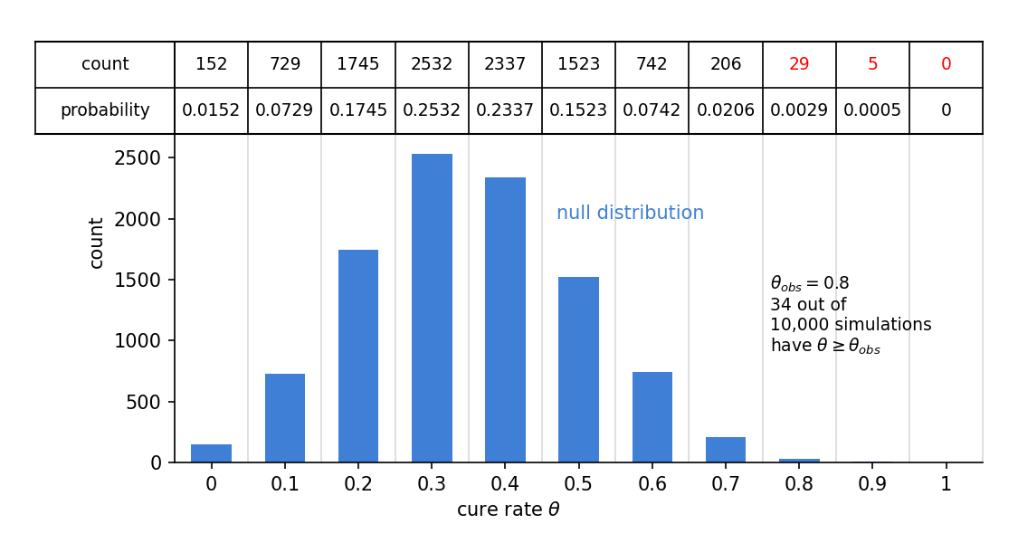
Figure 12.26 Distribution of cure rates θ under the null hypothesis that the background cure rate is 35%.