Girl Birth Rate: Two-Sided NHST
Figure 3.12 Null-hypothesis simulation for a survey of 300 births under a fair coin-flip model (P(girl) = 0.5). The two-sided surprise value counts results at least as extreme as the observed 52/48 split on either side of 50/50 — both tails are shaded, and each accounts for about a quarter of the simulated trials.
Every notebook here is yours to modify — swap in your own colors, styling, and data, and use it as a starting point for your own publication-quality graphics.
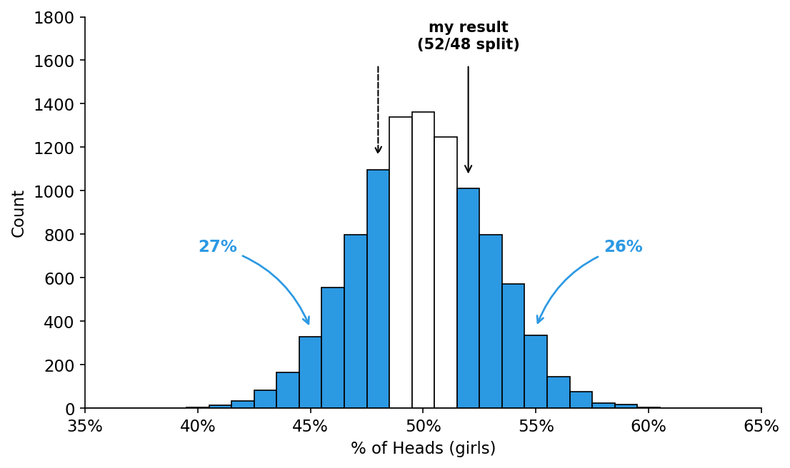
Figure 3.12 Null distribution of % girls across 10,000 simulated surveys of 300 births each. Both tails (≥52% or ≤48%) are shaded, since a two-sided test counts extreme results on either side of 50/50 as equally surprising.
Figure 3.12 — Two-sided surprise value for a 52/48 split
%matplotlib inline
import numpy as np
import matplotlib.pyplot as plt

plt.rcParams.update({'font.size': 11})
def despine(ax):
    ax.spines['top'].set_visible(False)
    ax.spines['right'].set_visible(False)

BLUE = '#2c99e3'

np.random.seed(0)
n_births = 300         # births simulated per trial
n_sims = 10_000         # number of Null Hypothesis simulations
p_null = 0.5            # fair coin: P(girl) = 0.5 under H0

pct_girls = np.random.binomial(n_births, p_null, n_sims) / n_births * 100

my_result = 52                          # observed split: 52% girls / 48% boys
mirror_result = 100 - my_result         # 48, the equally-extreme result on the other side

bins = np.arange(34.5, 66.5, 1)
fig, ax = plt.subplots(figsize=(7.5, 4.5))
counts, edges, patches = ax.hist(pct_girls, bins=bins, color='white',
                                  edgecolor='black', linewidth=0.8)
count_at = dict(zip((edges[:-1] + 0.5).astype(int), counts))

for pct, patch in zip((edges[:-1] + 0.5).astype(int), patches):
    if pct >= my_result or pct <= mirror_result:
        patch.set_facecolor(BLUE)

# Surprise value: fraction of simulated trials at least as extreme as ours.
# Each bar is 1 point wide and centered on its value (e.g. the "52" bar spans
# 51.5-52.5), so summing whole bar heights at the boundary double-counts
# results between 51.5% and 52% that aren't actually as extreme as 52%.
# We use the exact threshold on the simulated draws instead, so the number
# matches what's really "as extreme or more" -- the bars themselves (and
# which ones are colored blue) are unchanged.
n_extreme = np.sum(pct_girls >= my_result) + np.sum(pct_girls <= mirror_result)
p_right = np.sum(pct_girls >= my_result) / n_sims
p_left = np.sum(pct_girls <= mirror_result) / n_sims
p_two_sided = n_extreme / n_sims

print(f"right tail  P(>= {my_result}%)                 = {p_right:.1%}")
print(f"left tail   P(<= {mirror_result}%)                 = {p_left:.1%}")
print(f"two-sided   P(>= {my_result}% or <= {mirror_result}%) = {p_two_sided:.1%}  "
      f"({n_extreme:,} of {n_sims:,} simulations)")

ystep = 200
ymax = int(np.ceil((counts.max() * 1.3) / ystep)) * ystep
ax.set_xlim(35, 65)
ax.set_ylim(0, ymax)
ax.set_xticks(range(35, 66, 5))
ax.set_xticklabels([f'{x}%' for x in range(35, 66, 5)])
ax.set_yticks(range(0, ymax + 1, ystep))
ax.set_xlabel('% of Heads (girls)')
ax.set_ylabel('Count')
despine(ax)

ax.text(my_result, ymax * 0.99, 'my result\n(52/48 split)',
        ha='center', va='top', fontsize=10, fontweight='bold')
ax.annotate('', xy=(my_result, count_at[my_result] + ymax * 0.03),
            xytext=(my_result, ymax * 0.88),
            arrowprops=dict(arrowstyle='->', color='black', lw=1))
ax.annotate('', xy=(mirror_result, count_at[mirror_result] + ymax * 0.03),
            xytext=(mirror_result, ymax * 0.88),
            arrowprops=dict(arrowstyle='->', color='black', lw=1, linestyle='--'))

right_tag = my_result + 3
left_tag = mirror_result - 3
ax.annotate(f'{p_right:.0%}', xy=(right_tag, count_at[right_tag] + ymax * 0.02),
            xytext=(right_tag + 3, ymax * 0.4), color=BLUE, fontsize=11, fontweight='bold',
            arrowprops=dict(arrowstyle='->', color=BLUE, lw=1.3, connectionstyle='arc3,rad=0.25'))
ax.annotate(f'{p_left:.0%}', xy=(left_tag, count_at[left_tag] + ymax * 0.02),
            xytext=(left_tag - 5, ymax * 0.4), color=BLUE, fontsize=11, fontweight='bold',
            arrowprops=dict(arrowstyle='->', color=BLUE, lw=1.3, connectionstyle='arc3,rad=-0.25'))

plt.tight_layout()
plt.savefig('girl_birth_twosided.png', dpi=150, bbox_inches='tight')
plt.show()