Iris Dataset 2D KDE
Figure 2.24 A 2D kernel density estimate of sepal width and sepal length for two Iris species (setosa in red, virginica in blue). Darker colors denote higher density.
Every notebook here is yours to modify — swap in your own colors, styling, and data, and use it as a starting point for your own publication-quality graphics.
▶ Run interactively in browser ↗
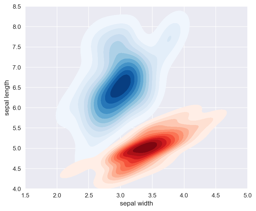
Figure 2.24 2D KDE of sepal width and sepal length from the Iris Dataset. Red and blue are two different species. Darker colors denote higher values.
Figure 2.24 — 2D KDE of Iris sepal measurements
%matplotlib inline
import numpy as np
import matplotlib.pyplot as plt
import seaborn as sns
from sklearn.datasets import load_iris
import pandas as pd

iris = load_iris()
df = pd.DataFrame(iris.data, columns=['sepal length', 'sepal width', 'petal length', 'petal width'])
df['species'] = iris.target

# Two species: setosa (red, wide sepals) and virginica (blue, long sepals)
setosa    = df[df['species'] == 0]
virginica = df[df['species'] == 2]

sns.set_style('darkgrid')
fig, ax = plt.subplots(figsize=(6, 5))
sns.kdeplot(x=virginica['sepal width'], y=virginica['sepal length'],
            ax=ax, cmap='Blues', fill=True, levels=12, thresh=0.03)
sns.kdeplot(x=setosa['sepal width'],    y=setosa['sepal length'],
            ax=ax, cmap='Reds',  fill=True, levels=12, thresh=0.03)

ax.set_xlabel('sepal width',  fontsize=11)
ax.set_ylabel('sepal length', fontsize=11)
ax.set_xlim(1.5, 5.0)
ax.set_ylim(4.0, 8.5)

plt.tight_layout()
plt.savefig('iris_kde_2d.png', dpi=150, bbox_inches='tight')
plt.show()