Power of a Study
Figures 11.8–11.9 Running the same bootstrap NHST at different sample sizes to see how power — the fraction of simulated studies that reach significance at α = 0.01 — changes with n. This is the static view of the notebook — click below to run it live in your browser.
Every notebook here is yours to modify — swap in your own colors, styling, and data, and use it as a starting point for your own publication-quality graphics.
Setup
%matplotlib inline
import numpy as np
import matplotlib.pyplot as plt
import matplotlib.patches as mpatches

plt.rcParams.update({'font.size': 11})

def despine(ax):
    ax.spines['top'].set_visible(False)
    ax.spines['right'].set_visible(False)

def diff(x, y):
    return np.median(y) - np.median(x)
Simulating power
For a given sample size n, repeat the whole study 10,000 times: draw a baseline group a,
build a treatment group b that's 25% higher, then run a 10,000-resample bootstrap NHST on each simulated
study to get its p-value. The bootstrap step is vectorized below (same statistics as a nested loop, just batched with
NumPy) so this runs in seconds instead of minutes — useful for running live in the browser.
def run_power_sim(n, delta_mult=1.25, alpha=0.01, n_outer=10000, n_inner=10000, seed=0):
    np.random.seed(seed)
    p_lst = []
    for j in range(n_outer):
        a = np.random.randint(45, 75, n)
        b = a * delta_mult
        obs = diff(a, b)

        aa = a - np.median(a)
        bb = b - np.median(b)

        idx_a = np.random.randint(0, n, size=(n_inner, n))
        idx_b = np.random.randint(0, n, size=(n_inner, n))
        rm_all = np.median(bb[idx_b], axis=1) - np.median(aa[idx_a], axis=1)

        p_lst.append(np.mean(np.abs(rm_all) >= obs))
    return np.array(p_lst)
def plot_power_fig(p_lst, n, alpha=0.01, bin_width=0.005):
sig_count = int(np.sum(p_lst <= alpha))
bins = np.arange(0, 0.4 + bin_width, bin_width)
fig, ax = plt.subplots(figsize=(7, 3.6))
counts, edges, patches = ax.hist(p_lst, bins=bins, color='#3f9fd6',
edgecolor='black', linewidth=0.5, zorder=2)
# tallest bar within the significant region, so the shading fully covers it
sig_bin_mask = edges[:-1] < alpha
bar_h = counts[sig_bin_mask].max() if sig_bin_mask.any() else counts[0]
ymax = bar_h * 1.22
box_top = bar_h * 1.03
rect = mpatches.Rectangle((0, 0), alpha, box_top, facecolor='violet',
alpha=0.35, edgecolor='magenta', linewidth=1.5, zorder=3)
ax.add_patch(rect)
ax.plot([alpha, alpha + 0.014], [box_top, ymax * 0.92],
color='magenta', linewidth=1.3, zorder=4)
ax.text(alpha + 0.016, ymax * 0.94,
f'{sig_count} simulations with p ≤ α',
color='magenta', fontsize=10.5, va='top', ha='left')
ax.axvline(alpha, color='magenta', linewidth=1.6, zorder=4)
ax.annotate('α = 0.01', xy=(alpha, ymax * 0.5), xytext=(alpha + 0.05, ymax * 0.53),
fontsize=11, color='black', va='center',
arrowprops=dict(arrowstyle='->', color='black', lw=1.2))
ax.text(0.6, 0.38, f'n = {n}', transform=ax.transAxes, fontsize=12,
ha='center', va='center',
bbox=dict(boxstyle='round,pad=0.4', facecolor='#e6e6e6', edgecolor='none'))
ax.set_xlim(0, 0.4)
ax.set_ylim(0, ymax)
ax.set_xlabel('p-value')
ax.set_ylabel('Count')
despine(ax)
plt.tight_layout()Figure 11.8 — n = 10
p_lst_10 = run_power_sim(10)
plot_power_fig(p_lst_10, 10)
plt.show()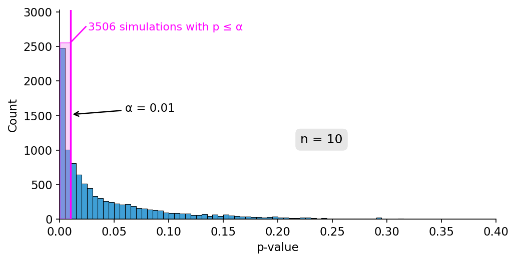
Figure 11.8 Power of the study when n = 10. 3,506 of 10,000 simulations reach significance at α = 0.01 (power ≈ 35%).
Figure 11.9 — a bigger study, n = 25
Raising the sample size to 25 per group increases the power substantially.
p_lst_25 = run_power_sim(25)
plot_power_fig(p_lst_25, 25)
plt.show()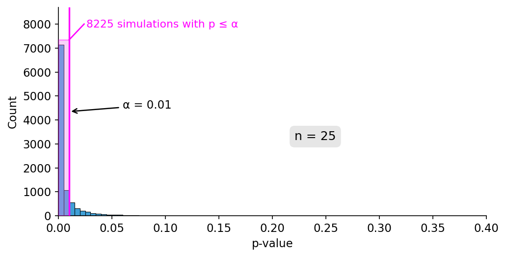
Figure 11.9 Power of the study when n = 25. 8,225 of 10,000 simulations reach significance at α = 0.01 (power ≈ 82%).