KDE Illustration
Figure 2.16 Kernel density estimates (black lines) for a 100-point SBP dataset (blue dots), using four different kernel widths (σ = 0.4, 1, 2, 3). Each panel shows the individual kernels (green) and their sum (black).
Every notebook here is yours to modify — swap in your own colors, styling, and data, and use it as a starting point for your own publication-quality graphics.
▶ Run interactively in browser ↗
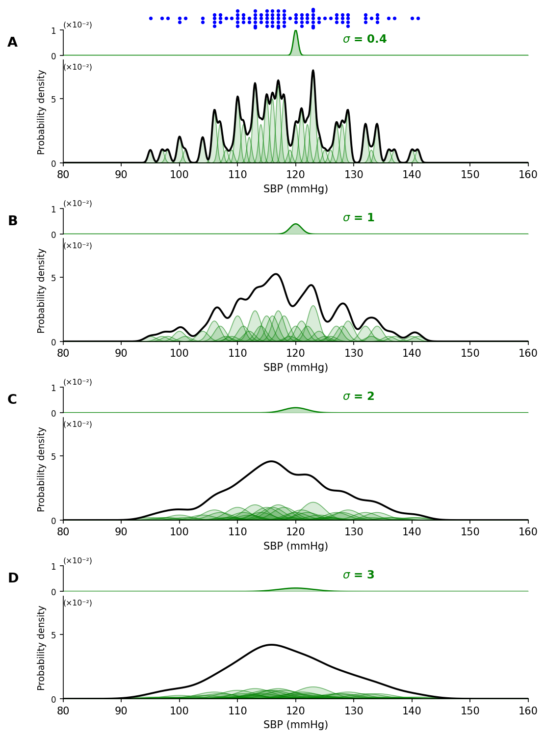
Figure 2.16 Kernel density estimates (black lines) for the same data set (blue dots), using four different widths for the kernel function.
Figure 2.16 — KDE with four bandwidths
%matplotlib inline
import numpy as np
import matplotlib.pyplot as plt
import matplotlib.gridspec as gridspec
import seaborn as sns
from scipy.stats import norm
from collections import Counter

s100 = np.array([ 97, 121, 118, 100, 121, 115, 116, 140, 120, 118, 134, 134, 115,
       132, 123, 110, 122, 121, 129, 112, 141, 133, 113, 123, 112, 116,
       137, 106, 113, 117, 108, 104, 118, 125, 117, 123, 122,  95, 124,
       123, 110, 122, 118,  98, 100, 114, 132, 110, 120, 115, 116, 124,
       117, 111, 116, 113, 120, 132, 134, 110, 123, 127, 129, 106, 104,
       111, 114, 128, 123, 127, 106, 117, 114, 127, 107, 129, 128, 115,
       110, 136, 119, 117, 113, 118, 115, 121, 116, 126, 113, 113, 128,
       109, 106, 117, 123, 107, 107, 111, 101, 129])

fillcol = 'green'
xmin, xmax = 80, 160
x = np.arange(xmin, xmax + 0.1, 0.1)
sigmas = [0.4, 1, 2, 3]
panel_labels = ['A', 'B', 'C', 'D']

cnt = Counter(s100)
vals = sorted(cnt.keys())
n = len(s100)

fig = plt.figure(figsize=(7, 10))
hr = [0.4,
      0.45, 0.08, 1.8,
      0.8,
      0.45, 0.08, 1.8,
      0.8,
      0.45, 0.08, 1.8,
      0.8,
      0.45, 0.08, 1.8]
gs = gridspec.GridSpec(16, 1, height_ratios=hr, hspace=0,
                       left=0.16, right=0.95, top=0.97, bottom=0.03)

panel_rows = [(1, 3), (5, 7), (9, 11), (13, 15)]

# Beeswarm strip
ax_bee = fig.add_subplot(gs[0])
sns.swarmplot(data=s100, orient='h', ax=ax_bee, size=3.5, color='blue')
ax_bee.set_xlim(xmin, xmax)
ax_bee.set_yticks([])
ax_bee.set_xticklabels([])
ax_bee.tick_params(bottom=False)
sns.despine(ax=ax_bee, left=True, bottom=True)

for sigma, label, (r_mini, r_kde) in zip(sigmas, panel_labels, panel_rows):
    ax_mini = fig.add_subplot(gs[r_mini])
    ax_kde  = fig.add_subplot(gs[r_kde])

    # Mini panel: single example kernel at loc=120
    y_ex = norm(loc=120, scale=sigma).pdf(x) / n
    ax_mini.plot(x, y_ex, color=fillcol, linewidth=1.2)
    ax_mini.fill_between(x, y_ex, alpha=0.25, color=fillcol)
    ax_mini.set_xlim(xmin, xmax)
    ax_mini.set_ylim(0, 0.01)
    ax_mini.set_yticks([0, 0.01])
    ax_mini.set_yticklabels(['0', '1'], fontsize=8)
    ax_mini.text(0.60, 0.52, f'$\\sigma$ = {sigma}',
                 transform=ax_mini.transAxes, color=fillcol,
                 fontweight='bold', fontsize=11)
    ax_mini.text(0, 1.06, '(×10⁻²)', transform=ax_mini.transAxes,
                 fontsize=7.5, va='bottom')
    ax_mini.text(-0.12, 0.5, label, transform=ax_mini.transAxes,
                 fontsize=13, fontweight='bold', va='center')
    ax_mini.set_xticklabels([])
    ax_mini.tick_params(bottom=False)
    sns.despine(ax=ax_mini, bottom=True)

    # KDE panel: all individual kernels + their sum
    rvs = [(cnt[v], norm(loc=v, scale=sigma)) for v in vals]
    for c, rv in rvs:
        y_k = c * rv.pdf(x) / n
        ax_kde.plot(x, y_k, color=fillcol, linewidth=0.6, alpha=0.55)
        ax_kde.fill_between(x, y_k, alpha=0.15, color=fillcol)

    y_sum = np.sum([c * rv.pdf(x) for c, rv in rvs], axis=0) / n
    ax_kde.plot(x, y_sum, color='black', linewidth=1.8)

    ax_kde.set_xlim(xmin, xmax)
    ax_kde.set_ylim(0, 0.08)
    ax_kde.set_yticks([0, 0.05])
    ax_kde.set_yticklabels(['0', '5'], fontsize=8)
    ax_kde.text(0, 0.9, '(×10⁻²)', transform=ax_kde.transAxes,
                fontsize=7.5, va='bottom')
    ax_kde.set_xlabel('SBP (mmHg)', fontsize=10)
    ax_kde.set_xticks(range(xmin, xmax + 1, 10))
    ax_kde.set_ylabel('Probability density', fontsize=9)
    sns.despine(ax=ax_kde)

plt.savefig('kde_illustration.png', dpi=150, bbox_inches='tight')
plt.show()