Survival Data: Two-Group Comparison
Figures 6.18–6.21
Every notebook here is yours to modify — swap in your own colors, styling, and data, and use it as a starting point for your own publication-quality graphics.
Beeswarm, histogram, summary statistics with boxplot, and big-box NHST resampling for Control (A) vs Treatment (B) cancer survival data. This is the static view of the notebook — click below to run it live in your browser.
▶ Run interactively in browser ↗
Note: This notebook uses
plot_utils — a helper module bundled in the interactive environment.
Setup — imports & data
import numpy as np
import matplotlib.pyplot as plt
import seaborn as sns
from plot_utils import despine, finish_plot, vline_labeled, MAD

COLOR_A = '#2c99e3'  # blue  — Control (A)
COLOR_B = '#fc6d76'  # pink  — Treatment (B)

grp_A = np.array([2.0, 0.3, 2.9, 1.8, 0.8, 1.1, 2.7, 1.4, 1.0, 0.4,
                  1.5, 4.9, 2.6, 2.6, 1.7, 1.6, 2.9, 2.2, 1.1, 2.2,
                  1.9, 0.6, 0.5, 0.9, 0.8, 0.6, 1.3, 2.7, 0.5, 0.8,
                  0.8, 1.0, 1.0, 0.7, 1.4, 2.4, 1.4, 0.5, 1.5, 2.2,
                  0.3, 2.4, 2.6, 2.3, 0.9, 1.3, 0.6, 0.7, 0.6, 3.9,
                  1.2, 0.5, 0.8, 0.7, 2.0])

grp_B = np.array([2.3, 3.5, 7.5, 6.9, 3.0, 4.5, 6.1, 3.4, 3.9, 1.8,
                  2.2, 4.6, 10.3, 8.0, 2.8, 2.1, 0.6, 12.7, 5.5,
                  1.7, 1.1, 1.5, 4.7, 1.0, 2.2, 0.9, 4.9, 1.8, 2.8,
                  3.0, 5.9, 7.1, 4.0, 3.8, 6.0, 0.3, 9.1, 4.3, 9.9,
                  1.1, 8.8, 2.7, 3.2, 5.8, 14.3, 0.8, 8.3, 1.6,
                  9.0, 1.6, 1.7, 8.7, 3.0, 5.8, 5.5, 6.6, 3.9, 0.5])
Figure 6.18 — Beeswarm plots
fig, ax = plt.subplots(figsize=(4, 4))
sns.swarmplot(data=[grp_A, grp_B], ax=ax, palette=[COLOR_A, COLOR_B], size=6)
ax.set_xticks([0, 1])
ax.set_xticklabels(['Control (A)', 'Treatment (B)'])
ax.set_ylim(-0.3, 15.5)
finish_plot(ax, '', 'Survival times (years)\nafter diagnosis')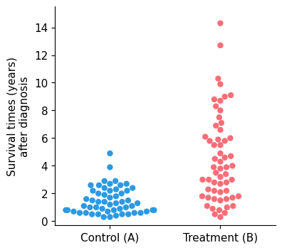
Figure 6.19 — Overlapping histograms
bins = np.arange(0, 17, 1)
fig, ax = plt.subplots(figsize=(7, 4))
ax.hist(grp_A, bins=bins, color=COLOR_A, alpha=0.6, edgecolor='white', linewidth=1)
ax.hist(grp_B, bins=bins, color=COLOR_B, alpha=0.6, edgecolor='white', linewidth=1)
ax.text(0.97, 0.94, 'Control (A)',   color=COLOR_A, ha='right', va='top',
        transform=ax.transAxes, fontweight='bold', fontsize=12)
ax.text(0.97, 0.78, 'Treatment (B)', color=COLOR_B, ha='right', va='top',
        transform=ax.transAxes, fontweight='bold', fontsize=12)
ax.set_xlim(0, 16)
ax.set_xticks(range(0, 17, 2))
finish_plot(ax, 'Survival times (years) after diagnosis', 'Number of patients')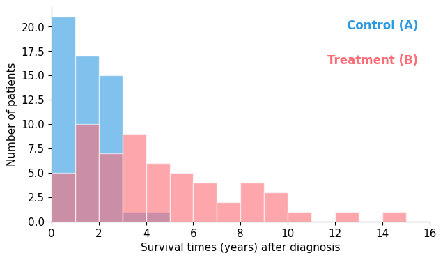
Figure 6.20 — Beeswarm + boxplot + summary statistics
fig, ax = plt.subplots(figsize=(6, 4.5))

# Beeswarm
sns.swarmplot(data=[grp_A, grp_B], ax=ax, palette=[COLOR_A, COLOR_B], size=6)

# Boxplots offset to the right of each swarm, median hidden, drawn manually
bp = ax.boxplot([grp_A, grp_B], positions=[0.45, 1.45], widths=0.14,
                patch_artist=True,
                medianprops=dict(linewidth=0),
                whiskerprops=dict(linewidth=1.5),
                capprops=dict(linewidth=1.5),
                flierprops=dict(visible=False))
for patch, color in zip(bp['boxes'], [COLOR_A, COLOR_B]):
    patch.set_facecolor(color)
    patch.set_alpha(0.4)
    patch.set_zorder(2)

# Median: thick wide bar; Mean: thinner bar
for x, grp in zip([0.45, 1.45], [grp_A, grp_B]):
    ax.hlines(np.mean(grp),   x - 0.07, x + 0.07, colors='black', linewidth=2, zorder=4)
    ax.hlines(np.median(grp), x - 0.1, x + 0.1, colors='black', linewidth=4, zorder=5)

ax.set_xticks([0.22, 1.22])
ax.set_xticklabels(['Control (A)', 'Treatment (B)'])
ax.set_xlim(-0.4, 1.9)
ax.set_ylim(-0.3, 15.5)
ax.set_ylabel('Survival times (years)\nafter diagnosis')
despine(ax)

def stat_box(ax, x, grp, color, bgcolor, label):
    mean_v   = np.mean(grp)
    median_v = np.median(grp)
    mad_v    = MAD(grp)
    text = (f'Mean    {mean_v:.2f} yrs\n'
            f'Median  {median_v:.2f} yrs\n'
            f'MAD     {mad_v:.1f} yrs')
    ax.text(x, 1.2, text, transform=ax.transAxes,
            va='top', ha='center', fontsize=10, family='monospace',
            bbox=dict(boxstyle='round,pad=0.5', facecolor=bgcolor,
                      edgecolor='none', alpha=0.85))

stat_box(ax, 0.25, grp_A, COLOR_A, '#d6eaf8', 'Control (A)')
stat_box(ax, 0.75, grp_B, COLOR_B, '#fde8ea', 'Treatment (B)')

plt.tight_layout()
plt.show()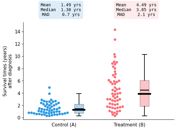
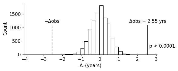
Figure 6.21 — NHST: two-box resampling
dobs = np.median(grp_B) - np.median(grp_A)

# De-median each group so resampled differences are centred at 0 under the null
grp_A_dm = grp_A - np.median(grp_A)
grp_B_dm = grp_B - np.median(grp_B)

np.random.seed(10)
N = 10_000
ds = (np.median(np.random.choice(grp_B_dm, size=(N, len(grp_B))), axis=1) -
      np.median(np.random.choice(grp_A_dm, size=(N, len(grp_A))), axis=1))

n_extreme = int(np.sum(ds >= dobs) + np.sum(ds <= -dobs))
p_val = n_extreme / N
print(f'Delta_obs = {dobs:.2f} yrs  |  p = {p_val:.4f}  ({n_extreme} of {N} simulations)')

fig, ax = plt.subplots(figsize=(6, 2.5))
counts, _, _ = ax.hist(ds, bins=19, facecolor='none', edgecolor='black', linewidth=0.8)

ax.set_xlim(min(ds.min(), -dobs) - 1.5, max(ds.max(), dobs) + 0.5)

line_top = counts.max() * 0.6
ax.vlines(dobs,  0, line_top, color='black', lw=1.5, linestyle='-')
ax.vlines(-dobs, 0, line_top, color='black', lw=1.5, linestyle='--')

label_y = line_top + counts.max() * 0.03
ax.text(-dobs, label_y, '-Dobs', color='black', ha='center', va='bottom')
ax.text(dobs,  label_y, f'Dobs = {dobs:.2f} yrs', color='black', ha='center', va='bottom')

ax.text(dobs + 0.08, line_top * 0.35,
        'p < 0.0001' if p_val < 0.0001 else f'p = {p_val:.4f}',
        color='black', va='top')

despine(ax)
ax.set_xlabel('Delta_i (years)')
ax.set_ylabel('Count')
plt.tight_layout()
plt.show()