Sex Ratio Near Power Plants: Confidence Interval
Figure 4.22 A parametric-resampling 95% confidence interval for a study that observed 52% girl births in a sample of 300 births near power plants. Resampling 10,000 simulated studies at the observed rate shows the range of percentages consistent with the data.
Every notebook here is yours to modify — swap in your own colors, styling, and data, and use it as a starting point for your own publication-quality graphics.
▶ Run interactively in browser ↗
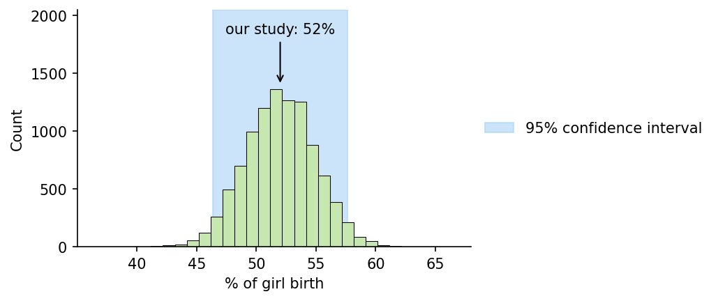
Figure 4.22 The 95% confidence interval for the study that observed 52% girl births in a sample of 300 births near power plants.
Figure 4.22 — Resampling-based confidence interval
%matplotlib inline
import numpy as np
import matplotlib.pyplot as plt

np.random.seed(1)
n = 10000
sample_size = 300
obs = 0.52  # observed proportion of girl births in the study

# Parametric resampling: simulate n studies of size `sample_size`, assuming
# the true population rate equals the observed rate.
x = np.random.choice([0, 1], (n, sample_size), p=[1 - obs, obs])
z = np.sum(x, axis=1) / sample_size * 100  # % girl births per resample

q_low, q_high = np.percentile(z, [2.5, 97.5])
# Pivotal (reflected) CI: mirror the percentiles around the observed
# statistic instead of taking them at face value.
ci_low, ci_high = 2 * obs * 100 - q_high, 2 * obs * 100 - q_low

fig, ax = plt.subplots(figsize=(7, 3))

bins = np.arange(z.min() - 0.5, z.max() + 1.5, 1)
counts, _, _ = ax.hist(z, bins=bins, color="#c6e8b0", edgecolor="black", linewidth=0.5)

ax.axvspan(ci_low, ci_high, color="#a9d3f5", alpha=0.6, zorder=0,
           label="95% confidence interval")

peak_height = counts.max()
ax.annotate(
    "our study: 52%",
    xy=(obs * 100, peak_height * 1.02),
    xytext=(obs * 100, peak_height * 1.35),
    ha="center",
    arrowprops=dict(arrowstyle="->", color="black"),
)

ax.set_xlabel("% of girl birth")
ax.set_ylabel("Count")
ax.set_xticks(np.arange(40, 70, 5))
ax.set_xlim(35, 68)
ax.set_ylim(0, peak_height * 1.5)
ax.legend(loc="center left", bbox_to_anchor=(1.02, 0.5), borderaxespad=0, frameon=False)
ax.spines["top"].set_visible(False)
ax.spines["right"].set_visible(False)

plt.tight_layout()
plt.savefig("sex_ratio_power_plant_ci.png", dpi=150, bbox_inches="tight")
plt.show()